Tuesday, December 7, 2010

Buzz and Woody


I never got to draw Buzz and Woody in the comics, but a Pixar fan site asked me to draw them a little something to commemorate the release of the Toy Story box set, and it seemed like the thing to draw for that. I do think it would be fun to use the Cars versions of the other Pixar characters for something sometime down the road. Don't you?

Monday, December 6, 2010

The King!


Around the time the third issue of Cars came out, it was time for Heroes Con in Charlotte North Carolina! That's pretty much the heart of NASCAR country, so we wanted to do a special edition cover that focused on one of the legends of NASCAR, and one of the stars of the Cars movie, THE KING! The King is a 1970 Plymouth Superbird that was driven by the great race car driver, Richard Petty (Who also provided the voice for The King in the movie.) Interestingly, the cartoon The King has a name, "Strip Weathers." It's a funny name but I don't know where they got it.

Anyhoo, so I did up a nice illustration of The King for this cover. I'd say what's unusual about this illustration is that it is completely drawn with a computer. I tried to draw it by hand, but those smooth, perfect contours were beyond my skills with a brush. So I scanned my pencil drawing and opened it in Illustrator, and used Illustrator to define the paths that my brush strokes would need to follow to draw this car right. Then I made some custom brush shapes and applied them to those paths. The result is an image that I think LOOKS hand drawn, but is in actuality much more perfect than I could have done by hand.

So, once I had the line art and once I had colored it, I had to come up with the King's logo and number. We were not given these by Disney, I had to make them myself, based on what I could find online. I found a picture of the Dinoco Hauler, the semi truck that carries the cars from one race to the next, and used that as the template for the logos, and I made them in illustrator.

So now I had all the part I would need for this cover, all that remained was to put them together in a way that was balanced and looked cool. I did up 6 versions with slight variations in placement and let Paul choose the one he liked the best. I am posting all the versions here. The one we decided to go with is the last one at the bottom. I agree with Paul, that one was the best! I really think this was a cool cover.

By the way, in case you're ever in North Carolina, head on up to the Richard Petty museum and THIS is what you will find!


Yep! That's the King! One of the coolest things about the Cars movie is how many of the cars are REAL. There is a REAL The King, and you can go see it for yourself! (Just don't touch it! He he!)

Also, interestingly, right across the street from the convention center where Heroes Con is held each year is the NASCAR museum! It's a really cool exhibit, and they even have a Richard Petty #43 car there, but it's a 67 Plymouth. I wish the Petty Blue Superbird had been there, but there was plenty of other cool stuff so I wasn't too disappointed.

Friday, December 3, 2010

Gotta keep 'em on-model!


This cover was perhaps one of the biggest revisions I ever did. And it was all my own darn fault! See, when I drew this one, I didn't have all the details of Mack's trailer figured out quite right. The first version I did, which is actually the second picture I posted here, doesn't have the trim or the air conditioning units or the other structures on there like they should be. I just drew a box with the big Lightning Mcqueen decal on the side. Paul Morrissey, the editor of the Pixar books at Boom at the time, caught this one and told me that we need to get the trailer right because he was pretty certain that Disney would ask for us to fix it anyway. It wasn't really a very easy fix, either. I had to draw the missing stuff, composite it into the original line art, import the line art to the color file and then tweak the color layers to match up with the new structures and contours. I think it came out pretty good, tho, I don't think you'd ever know that I had to fix it up as extensively as I did. And, I gotta say, figuring out how to do edits like this came in VERY handy when I started to do art corrections to interior pages later on down the road. So, no problemmo, really. Time well spent.

Actually, this cover is an early favorite of mine. I think I was really starting to hit my stride with this. It's a very friendly, positive portrait of Lightning McQueen and his pal, Mack. The story, "The Rookie," written by Alan Porter, is about how Lightning McQueen met Mack and about how they helped each other accomplish their mutual goals, McQueen to be a big-league race car, and Mack tobecome a mig league hauler. This is the basis of their friendship, and I imagine that together, going across country, living the dream, they would have had some pretty good times together. That's what I wanted to show with this image, that they are pretty solid friends. And I think it's a very pretty images as well. I was getting the hang of my painterly style and process and finding that my skills were getting more reliable. Look at those clouds! Look at that backgorund! just beautiful, I say. This cover make me very proud.

Hope you like it too! It's Friday, so check back again on Monday and I'll show you some more nifty stuff!

Thursday, December 2, 2010

"Make McQueen 20% Bigger"


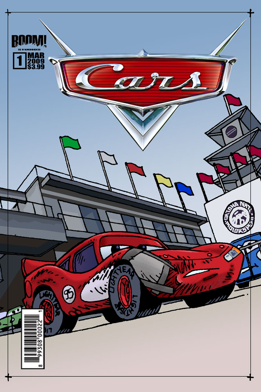
This is my first version of the "A" cover for Cars issue 2. In the story, the Rookie McQueen is encouraged by his new friend, Mack, the semi truck, to approach the Rusteze Brothers, Rusty and Dusty for race sponsorship. McQueen finds their business and appearance distasteful, and so he's a little reluctant. So I chose to illustrate this moment for this cover. I did it up, and I felt quite a bit more comfortable after having done the covers to issue 1, but I was still figuring things out. When I look at it now, I think my use of filters on the street is a little awkward, and my painting of the clouds and sky, while interesting, just isn't quite right. There's room for improvement, but by and large I think it looks pretty good. By this time I was heeding Steve Buccellatto's admonishments to avoid the use of k-tones in the coloring. K-tones is the black ink in the CMYK printing process, and they can make colors look a bit muddy. By and large, I still avoid k-tones except in the line art. You WANT the line art to be black! The other exception I make these days is when I am trying to make a deep, deep red and when I WANT the colors to be dark and muddy. It seems, when you want a really deep red, nothing works as well as a little black in it. 20% or 30% is usually enough. When you try to get that DEEP red with just CMY, it doesn't come out right. It will look wierdly purply orange. But exceptions aside, I avoid k-tones And I did so on this cover, and I think it looks pretty nice


Well, when this cover came back from Disney, it was approved, except that Disney wanted a very specific change. They said that McQueen needed to be 20% larger. It was kinda funny, Paul said he didn't know how they came up with that specific number, but there it was. I had to select and isolate McQueen, enlarge him by 20% and make it seamless, so it doesn't LOOK like a correction. A little fiddling around with Photoshop and I think I managed to do that.

Here's a before and after of that adjustment


Not too bad! And you know, figuring out how to do this turned out to be a skill I would call upon again while doing Cars. Disney didn't often require that I do a lot of changes to my work on Cars, a fact I note with pride! But it happened from time to time, and my ability and willingness to do these corrections turned out to be a very important part of my job. When working on licensed characters, you have to be ready to respond to editorial requirements like this. !t's part of the job! And I think my generally agreeable attitude about this eventually led to continued work, and, I think, was the thing that led to my big chance to do pages!

You know, while I enjoyed doing the covers, and believe me I DID, what I really wanted to do all along was PAGES. It would be almost an entire year before I would get that chance. I'm a cartoonist FIRST. I want to draw PAGES. You can bet I'll talk about that when I get to it.

But first, I have one last thing to say about this cover, and it has to do with the rusty patina on the Rusteze Brothers.


See, the surface of the Rusteze Brothers is a rusty paint and metal patina. I could have used a fancy splatter brush or a filter or something. That is certainly what is being done on the interior pages, but I just HATED how those Photoshopy gimmicks looked. I resolved to use Photoshop like a painting tool, and I PAINTED the patina. I pushed the colors back and forth, changing my opacity and layer effects until I got a look that was descriptive and yet still looked hand-done. I think the look I came up with is pretty nice. It's simple, graphic, clear, and while it's a bit flat, I don't think it comes across as careless or too cartoony. In a wierd, digital way, it looks just the right amount of cartoony. It has weight and contour, variety and moments of improvisation. I think doing this bit here really solidified how I would approach coloring the Cars from now on. I wanted them to have a clean, hand-done, simple, and relatively gimmick-free look. I wanted them to look painted, but not painted in a way that simulated paint. I didn't think it would look good to HIDE the fact that I was using Photoshop. By simulating paint, I mean that I would use Photoshop in the same way that I would use a real set of paints on a real pallette. If I wanted to make a color, I would use the multiply, screen and opacity settings of my Photoshop brushes and layers to make that color, which is a lot like painting with oils. When you paint with oils, you begin with a few basic hues, and you use your knowledge and experience to figure out where between those basic hues the very specific hue you need is, and then you combine your paints to create it. That's what I did with Photoshop. Rather than look around on the color picker endlessly for that ONE color I wanted, I just set up a basic swatch pallette and painted. It was painting without the mess and clean-up. I'm painting with Photoshop.

Thanks for checking this out again, y'all. Keep on coming back.

Wednesday, December 1, 2010

Another cover concept that you haven't seen!


Like I said in my last post, when doing this stuff, you throw a lot of material at the wall and just see what sticks. So this is an alternate cover concept for that pitch, where in the earlier post we see the trouble that McQueen would get into in our story proposal, here we see some of the fallout. Again, it's important to note, these were sketches for a concept that we did not get to run with, but I don't mind, because with these illustrations, I was really just practicing, figuring out how to meet the demands of the gig in the months before we got the green light. When we got the word "GO!" I was going to have to "GO!GO!GO!" and be absolutely ready to do the work and do it well. I'm glad I did it, I think the gig worked out well for me!

I think it was a cool story idea, hope we get a chance to tell it some day...